|
During World War two, people had to ration due to shortages in food, clothes etc. This meant that fast fashion could no longer be used to buy new clothes. As you can imagine, for young people growing up, this would have been an issue. Consequently, the government sent out the 'Make Do And Mend' pamphlets to encourage people to make the most of what they already had around their households. This included turning old clothes into new ones. Women would unpick old jumpers and turn them into new and improved clothes. I can imagine this changed fashion radically.
Covid-19 has encouraged photographers to think in new and creative ways. whilst it has restricted many aspects of photography it has opened up new ideas; using scraps of old paper, old masks, gloves thrown on the floor, signs and many more. Covid has changed our perspective on photography and made us make use of what we already have -just like fashion in world war 2. However, although this idea has to be more prominent now, the idea of appropriating others photographs and using old scraps has been about for a while. |

|
To begin this new way of thinking i used scraps of old paper to create collages and took photographs from different angles. I had to consider different colours, angles, focusses and light in order to create the images I desired.
|
|
I really like these photos, i think they are colorful and interesting as i played with focus and different materials. The vibrant blue contrast whilst also harmonising really well with the almost cherry red. The image with the circling close to the frame is probably my favourite. I believe this because the circular frame is drawing the audience into the beautiful face and subtle colours of the lighter across her face. Maybe symbolising inner beauty. However, in some of the others, i believe i could have focused on a bigger part of the collage instead of getting so close up, this would have given a better insight into what the collage looked like and how i got to these images. It would have also added more elements and maddest look more visually interesting. On the contrary, I think the zoom in works for the very first image. This is because you cannot make out what the image is of leaving it to interpretation and the colours forming organic lines makes it almost liquid like. The light reflecting from the surface of the collages almost adds another dimension and makes the collage look more busy making up for the fact there aren't any elements, this demonstrates me working with what I have. Although there needs to be improvement, I think that for my first try at collage in this specific topic, I did relatively well. I didn't find it too challenging so perhaps next time I should concentrate on smaller details and really focus on what I'm trying to convey to the audience.
|


This idea of make, do and mend has been used in many occasions throughout history...

|

|
After years of the Mona Lisa sitting in one of the most famous art galleries and standing as one of the most famous art works of all time a man called Marcel Duchamp, in 1919, decided to create a variation of the painting. This caused much upset as this had never been done before.
Describe Leonardo's painting and explain why it is so famous.
The Mona Lisa is of a woman ,whose identity people are still unsure of. The way her eyes will stare at you from any angle has made this painting even more amazing. It has been recognized as a form of 'good art' even before it was finished. It has always been held, very protected, in the Louvre art gallery, however after being stolen and unseen for over 2 years, security became even stronger. This oleic of artwork became very important ti French citizens quickly. After Marcel created a variation it became even more popular too as it made people realise how desirable the Mona Lisa actually is for this came as such a shock.
Describe Marcells variation, the title, the facial hair ect.
Marcell's adaption of the Mona Lisa didn't have a positive initial reaction as this had never been attempted before. Especially to such famous piece of art work. The title L.H.O.O.Q is an expression particularly aimed at women. It is a pun where the letters pronounced in French sound like "Elle a chaud au cul" which translates to "She is hot in the arse". He did this to imply that women have sexual restlessness. This is a contrast to the rather elegant and respectful looking woman in Leonardo's image. The facial hair adds to this idea but also to awaken 'artists' and make them think what real art actually is.
what do you understand about the term 'readymade'?
The term 'readymade' in photography is when an artist appropriates an already existing image, changing it to create something new. Marcel Duchamp took Da'Vinci's Mona Lisa and change the already made image into something new.
Why was Marcel Duchamp's idea of the 'readymade' such a revolutionary idea in art?
The idea of changing an already existing image had never been as populated as Duchamp's work became and this lead to high levels of controversy. People saw it as cheating or an easy way of art and it completely went against everything that art was seen as at the time. It encouraged artists to become more abstract and open to new forms of art. This variation of the Mona Lisa radically changed society's mindset and how art was viewed.
KENSUKE KOIKE.
Kensuke Koike is a Japanese artist who works on manipulating images to create new and weird ones. Sometimes making an image ,with originally only one object, look as though it has four. He achieves this through cutting, sticking, tearing, slicing and assembling.
Koike found himself loving black and white vintage photographs after visiting art markets and picking up unwanted images. His love for these vintage gems meant his art pathway changed radically. He began collecting and composing them in interesting ways in order to create something completely new. This was a relatively new idea to art so was particularly intriguing and caught attention quickly.
The videos documented on his website show him tearing, placing and manipulating these old images ending with a completely new piece of work.
His artwork links to the theme make do and mend as hes making use of unwanted or old things and making new ideas and creations out of it. Just as people had to do in WW2 and just like what Marcel Duchamp did to the Mona Lisa.

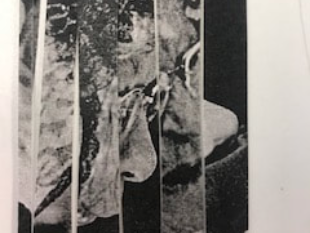
In this image, Kensuke has taken an old vintage image of a young boy, perhaps nine or ten, in an outfit that looks out dated, sectioned it into three and rearranged it in such a way that we can still make out what the original image would have been. The way the sections have been composed means that the edges from each body part is still connected and matched up. The neck is attached to half a leg, the collar is attached to the bottom of a leg and the object in the back has been made to finish off the shins. I believe this adds fluidity to the image even though the original is clearly being disrupted by the harsh lines between each section. I find it intriguing how the viewer can make out exactly what the image is off even though the middle section has been spun. This demonstrates 'make do and mend' as he has used a dated vintage photograph and has turned it into something new and original fitting to his style of work. This image could have been taken during WW2, when the idea of make do and mend came to real life. Kensuke could have been showing what war does to people, young children as well. It almost distorts and breaks people, and even when it ends they are still not how they where before as the scars of war stay.


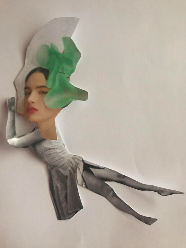
I am satisfied with how i have done however i do believe i could have been more creative an adventurous with how i approached this task. Instead of only cutting strips, i could have woven or stuck, maybe incorporated some colour for contrast. I found this task quite hard as I struggled to come up with ideas. I wanted to reflect Kensuke's work whilst also making it original to me. I began by thinking of ways in which I could make the most out of the two women, I could distort them and make it seem like there are more than juts two. So I set out to cut the image into strips and played around to see what I could come up with...
|
This is the final result of me playing with the strips of paper. As Kensuke demonstrated in the image of the boy, I made it so at least one line connects from each strip of paper. Although this image makes no sense when first looking, it begins to unfold the more you look because of the connections these lines have. I like the way this is only two women, although it seems as though each strip is from a different person. Almost as though it represents different emotions/sides of people. As I was making this I wanted to make it seem like the development of a face, the evolution perhaps of a human through their life. I think I kind of conveyed this, however I could have displayed it better with different parts of the faces. |
|
HANNAH HOCH.
Since Marcel Duchamp's work, there have been other artists who use the idea of make do and mend to inspire there work. Hannah hock is one of them. She uses a selection of photographs and collages them to create something completely new.
|
Known for her political collages Hannah Hoch combined images found in magazines, old news papers and even sometimes scraps from bins. These scraps where usually from mass media to critique popular culture. This included how the roles of women where viewed in society. She used art as a way to educate people and put across important messages. At the time she was working on some her most populated collages was around the same time as the weimar period. This was a time of great political and economic struggle for Germany after accepting blame for the war. Germany soon fell into a great depression- this could be reflected through some of her collages.
|
|


|
This particular image is my personal favorite. The sharp red chosen for the background makes the figure look as though it has an outline meaning it stands out more. The composure of this image is very simple allowing each aspect attention. I see a woman, shirtless, with a skirt standing on a hill. The fact that the body of this woman is a statue, could be Hoch hinting at how society objectifies women and there bodies. Furthermore, the individuality of this woman could be her singled out, perhaps the red background connotes danger or an emotionally intense situation.
Finally, the distortion and obscurity of the figure could be representative of the effects post war had on the people of Germany. The sharp red connoting blood and danger could also foreshadow the upcoming uprising of the Nazi party. |
to make my own collage i used these three photos. Two of them re vintage and old, as Hoch uses, and the other is a more modern magazine cover.


SHARON WALTERS.
Sharon Walters makes hand made collages out of woman's magazines, donated photographs or sometimes photographs of herself. She explores culture and identity mainly focusing on the empowerment of black women. She cuts out parts of these images and puts bold strong colours as backgrounds to display these messages. Walters uses materials to empower the figure in the collage.


As you can see, she focuses on contrasting colours and removing pieces of the face a body so that the viewer focuses on line and intricacy. Furthermore, Walters leaves the parts where the person looks most empowered.
|
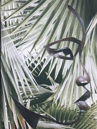
This image has to be my favorite of Sharon Walters work. This collage is of a stunning side profile, almost shaded and shaped by the overlap of the leaves in the background. This creates a more 3D affect. Walters cut out most of the face but left the main, important features behind leaving a slick clean finish. This woman looks courageous and powerful even though her face has been simplified. The continuous line affect adds a calmness to the image as do the leaves . The idea of natural beauty is a main theme throughout this collage for me. The beauty of the female figure and the background being leaves- nature.
|
|
LEONARD FREED- BLACK IN WHITE AMERICA
After travelling and finding a passion in photography, Freed let go of his dream to be a painter.
In 1998 he first published his powerful collection of photographs which looks at African American life during the civil rights era. Freed was inspired to capture the experience of the everyday lives of African American people whilst he was in Berlin. His images are taken on city streets, in housing projects, in rural town communities and many more everyday places. His images show happiness, power and joy within black communities, although this was the greatest social struggle yet.
In 1998 he first published his powerful collection of photographs which looks at African American life during the civil rights era. Freed was inspired to capture the experience of the everyday lives of African American people whilst he was in Berlin. His images are taken on city streets, in housing projects, in rural town communities and many more everyday places. His images show happiness, power and joy within black communities, although this was the greatest social struggle yet.


Here, i have taken an image of an old man from Leonard Freed's 'This Is America' and have changed it in a way Walters would have. My idea behind this was too remove sections and cut closely to each. I am proud of how this came out however, i believe next time i should focus on empowering the main figure further just as Sharon Walters achieves. I think that the patterns created at the bottom of the image i have cut out from makes a simplistic but effective affect and i should have continued this on the face.
THE ELDERS- Franklyn Rodgers and Simon Rowe
To further develop my skills in Walters style of photography i decided to use images from The Elders collection by Rodgers and Rowe. They also focused on celebrating African Americans but more specifically the older generations. Their images show power, intelligence and dominance.


These are the three images i decided to use as i think they are all quite different but display the same messges. They all show beauty and independence.
|
This is my favorite image. I think that the angle used is really effective as it seems as thought the woman is looking down on the viewer, almost making the them feel weaker. The fact she has no facial expression shows dominance and a sense of independence as does the lighting. The lighting shades her neck making her face stand out even further and also brings out her wrinkles. Because of how much power this woman holds in this image her wrinkles, to me, shows wiseness and experience, instead of connotations of elderly weakness. |

|
Thinking about how I was going to cut out parts of these images was rather difficult. I didn't want to extract from the empowerment or the messages being conveyed. I wanted the highten them.
|
|
Here is how i cut the first of the three images. As you can see i cut in the shape of how her face or hair went, I am particularly proud of the hair and how i followed the direction of the lines. However, next time i think i should work on making smaller more detailed lines as well as the larger shapes.I think turning the paper around and placing it on a black background looks really effective too. |


|
Working on my self feedback from the work above, i used the third of the three images and worked on making smaller lines. I believe i achieved this on the forehead and around the face. I really like the shapes created on the bottom half of this, however, i think it is too over crowded. Next time i think i should add some kind of background so there is some colour to make these images more interesting. |
|


Here is the second of the three photos. I loved how this turned out as i kept a rather simplistic effect whilst making smaller lines as well as larger shapes. I feel as though i followed the lines of her facial structure well and i also incorporated the patterns on her shirt. The colored backgrounds adds a really nice contrast to the blue of the shirt but harmonizes really nicely with her skin tone. However, i believe cutting out her lips almost extracted from the power she held in the original image, although its not all lost.
Romare Bearden.
Romare Bearden used personal memories, African-American cultural history, and literature a an influence for his art work, these are the ideas he incorporated. He made his collages so aspects of African-American life where woven within universal themes.
His style was influenced by many different things including western European art, African sculpture, the art of the people living at the same time as him in America and Mexico, and finally music. The particular music styles he liked and used to influence his art where blues and jazz. He’s most famous for his collage work in which they where unique and innovative. On top if his collages he also made paintings in watercolor, gouache, and oil, edition prints, monotypes, murals, and one assemblage sculpture.
His style was influenced by many different things including western European art, African sculpture, the art of the people living at the same time as him in America and Mexico, and finally music. The particular music styles he liked and used to influence his art where blues and jazz. He’s most famous for his collage work in which they where unique and innovative. On top if his collages he also made paintings in watercolor, gouache, and oil, edition prints, monotypes, murals, and one assemblage sculpture.


|
This is my favourite image. I believe this is because it is the most visually interesting out of the three I've displayed. Whilst I can see figures fighting in the centre, which stand out greatly as the darkness contrasts with the vibrant frenzy of colours in their surroundings, there is also a boat afloat and birds flying across the Skys, which are unusually a bright red. This could imply that it is sunset. The geometric simple lines are cleverly used as it allows the whole image to be bustling with action without coming across as too much. The white birds, perhaps doves, could symbolise peace which is rather the opposite of the fight going on. This image as a whole is full of elements which contrast each other, including colour, which I think is really interesting and makes it different from others.
|

|
ASSESSMENT.
On the lead up to our making day, we began by cutting out sections of magazines we were most attracted to in order to make a 2 dimensional collage which would soon be 3 dimensional.


This is my first sculpture/response to the images I chose to incorporate. This was actually rather hard as I found I didn't cut enough images out to began with. Finding images to match the theme was really hard but once I had a clearer idea of what I was going to do and how I wanted it to look, I found it easier. I began by thinking about all the people and faces in the magazine and wanted to stack them onto of one another making it a huge crowed of heads. This is the middle section of the sculpture. I then wanted to add dimension and height. I tackled the height by using larger full body figures and placed them behind the crowed of people almost looking as though they are the leaders. For dimension, I needed a stand so I could stand all these figures upright. I wanted to contrast the almost crazy, fun mood of all the people so decided to cut out n office scene. I cut this out and put it on black card then proceeded to fold the bottom in a such a way that it stands without support.
Im really proud of how this came out, I love the 3D affect and how the whole sculpture can be portrayed. I think the red background is far nicer and contrasts but at the same time compliments the collage.
Im really proud of how this came out, I love the 3D affect and how the whole sculpture can be portrayed. I think the red background is far nicer and contrasts but at the same time compliments the collage.
|
This is my favorite image I took of this 3D collage. I think the red background works really well with the collage as it gives a yellowy orange wash over the gathering of people setting a peaceful mood and allowing a harmony of colour. I think this is a really nice contrast to the partying figure behind them as it can add something more uplifting. The straight on angle at which I've taken the image works particularly well as the subtle shadows in the background reveals that this is a 3D sculpture. Furthermore the base of this collage shows a set of buildings and an office, I like how this angle makes sure they are only slightly seen and so adds the contrast i wanted it too without showing it too much.
|

|
Our target was to make three of these 3D collages, so once i had finished the first i began generating ideas for the second...
|
|
So my initial thoughts for this 3D collage was to have individual standing buildings with people walking around so it would look like an abandoned city. I chose the black background to add an eerie sense to the final outcome and so it would give the affect that it is night time. I believe I executed this idea quite well actually. When i cut out the buildings i had an idea to make it even more surreal. I decided to photo copy two of the buildings, two times each time with different colours and in a different position, so they would over lap and make a glitch affect. I think this adds a mysterious mood and almost look like the people are within a game. I believe next time i could take the photo from a more downward, looking up angle so that the buildings look larger and so they loom over the viewer.
|


I struggled to find ideas for the last one, i wanted to make each collage as unique as possible ....
|
|


ABIGAIL HUNT:


Abigail Hunt's artistic practice is based upon finding manmade images and transforming these into beautiful, delicate 3D collages through investigation, deconstruction and imagination.
Abigail uses the same process each time she begins on a new collage to achieve the best outcome possible and to really understand what she is working with and the meaning behind her findings in order to generate ideas. Hunt begins by researching about the image she has found before dissembling and deconstructing it in the way she believes is best and then finally using these parts to create something new- reassembling and reconstructing the object or image. These processes ensure Abigale to make sure the ideas around the original image is still present but translated into object form/ 2D-3D. Abigail creates her own structures, tones and descriptions.
Abigail uses the same process each time she begins on a new collage to achieve the best outcome possible and to really understand what she is working with and the meaning behind her findings in order to generate ideas. Hunt begins by researching about the image she has found before dissembling and deconstructing it in the way she believes is best and then finally using these parts to create something new- reassembling and reconstructing the object or image. These processes ensure Abigale to make sure the ideas around the original image is still present but translated into object form/ 2D-3D. Abigail creates her own structures, tones and descriptions.
''Abigail Hunt's fascination with paper and repetitive and almost incomprehensibly impossible and meticulous processes has continued to be of interest within her work. Continually questioning notions of finite detail, artistic integrity and aesthetics, works consider ideas of definition and the point at which, through the process of change or deconstruction, an object becomes something it previously was not''
-- Abigail hunts website
|
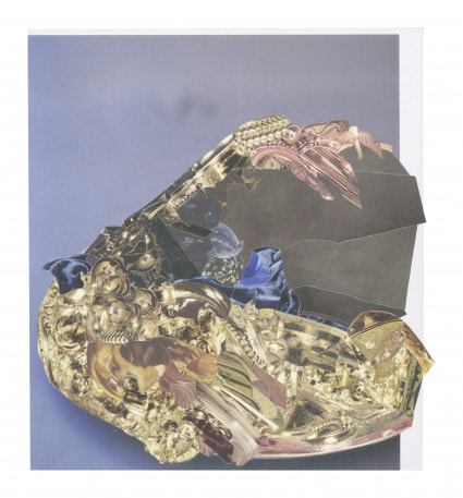
I think this is my favourite 3D collage of Abigail's. This piece of work belongs to a collection called ' a romance of many dimensions'. Romance is almost a feeling of excitement and mystery associated with love. I believe this really reflects her process of work as the new images she finds and chooses sparks a sense of excitement into the ideas she is about to explore and it is a mystery as to what she is about to find out and create. Romance is also something quite rare beautiful and connotes deep happy emotions. I believe this collage reflects this through the shining gold surface of the image used. Furthermore, romance was a big thing in medieval tales. The patterns and cut outs of podiums I can depict in this image look like a part of this time period. However, with romance can come, bad and negative emotions, if it doesn't work out. This is demonstrated in this art work by the dark area taking over almost half of this collage. This dark area contrasts with the bright shining gold making it stand out more.
|
BEHIND BARS.
Prison is an extremely confined space where criminals have very little freedom and very little space in which to live. They have to share this space with many other criminal's - barely any privacy- and are controlled by rules, warnings, restrictions and constraints. Prisoners freedom is completely stripped from them and boredom overrides their time in jail. We were looking at prisoners in photography as there are similarities with being in prison and being in the current lockdown as we also have restrictions and have only a limited amount of times in which we can go out.
Nicolò Degiorgis ran a photography workshop for the inmates and although having many limitations given by the rules of the prison, he worked around them. I believe this collection of images really allows people an insight into the everyday life of a prisoner and how little of the outside world they can see and interact with. Here are some of the images from the collection of images taken.
Nicolò Degiorgis ran a photography workshop for the inmates and although having many limitations given by the rules of the prison, he worked around them. I believe this collection of images really allows people an insight into the everyday life of a prisoner and how little of the outside world they can see and interact with. Here are some of the images from the collection of images taken.
My personal meaning of genre is when different styles of a particular subject area are categorized and grouped according to a certain similarity. There are different genres of music, art, film, photography ect..
|
Here is the way the dictionary defines the word 'genre' |

|
Within photography come many different genres, here are just some of the main examples:
-food
-street photography
-underwater
-social documentary
-fashion
-portrait
-architectural
-landscape
Out of all photographic genres my favourite is probably street photography. This is when the photography will capture everyday human actions in particular outdoor surroundings. Street photography is not only about capturing the street but ensuring it is capturing the soul and life of those streets. Most of these images are ones where the focus is oblivious to the fact that the image is being taken. Street photographs are lively and have a story and meaning behind them. The photographs taken in the image above somewhat are street photography, but because in a prison there are no streets, some of the portraits capture the loneliness of prison life and could be reflective of what 'streets' are in prison.
''Landscape Photography Definition Landscape photography is capturing an image that embodies the spirit of the outdoors. It carries a sense of being there to see something incredible. When viewers look at your work, their hearts should jump.''
This quote describes what landscape photography is supposed to look like. However I would define it differently; a landscape photograph in my opinion is a photograph which captures the scenery from the photographers view. In the collection of images above categorized under 'landscapes' are rather dull and show not much scenery. I think this is really reflective of how restricted inmates are to the outside world and how little freedom they have. According to the quote these are hardly landscape images and instead of encouraging feelings of amazement and excitement they encourage feelings of loneliness and boredom. However, to me these are landscape images for they are the only views inmates can capture from inside the prison perhaps reflecting how cut off they are. The restriction of hardly having any windows and not many interesting views would have made it very hard for the inmates to capture any interesting landscape photographs.
All of the images in this book fill the right hand pages, either they are displayed in a portrait format or a landscape format (this is a different type of landscape, meaning the orientations of the image). Most of the images are portrait, however the landscape images are landscape. This could be the inmates trying to make the landscapes as landscape as possible as they cannot get 'proper' landscape photographs.
I believe the faces in the fashion pictures are pixilated because the inmates don't want people to know their identity as it would instantly set them out to be a bad person and have a bad reputation when they are finally released. Most inmates will have learned their lesson and will not want their experience to be carried into the outside world where they can finally start over. The fact it is blurred changes the focus to the outfit and the surroundings, this is going to make the viewer Understand the environment instead of looking at identity. Furthermore, it adds a sense of secrecy and mystery perhaps luring the reader in and affectively making them want to know more.
my response
As a response to this collection of images I decided to pick a genre at random and take photographs corelating to this genre but was given restrictions, so I could have a feel for what it was like to be the inmates working with many restrictions when taking photos.
here where the restrictions:
The genre which I picked was still life.
here where the restrictions:
- You must be sitting when taking the photograph
- The photograph must be black and white
- You can only photograph another photograph
- Your photograph must be square
The genre which I picked was still life.
When walking round my house, restricted to what I could capture in an Image, I found it hard to do anything that was visually interesting. I took an approach to this task in which I would go to the most suitable place in my house where I thought the photo would look best and capture the moment.
- You must be sitting when taking the photograph


An obvious place to go in a house when wanting to sit down, is the kitchen table. Sitting on the counter was a coke can and some soya milk, I wanted to make a simplistic image, however initially it was too simple. I decided to squeeze the can of coke and almost break the theme of geometric straight lines. I created a contrast.
- The photo must be black and white

Because I have tiles along my floors from the front door, I thought the more organic patterns contrasting to the straight lines on the stairs would look visually interesting in a black and white monotone, for there won't be many colors to distract from these patterns. I stood a couple stairs above the floor, zoomed in so my feet weren't in it and captured the image. It turned out that the lines of the gate made a really cool contrast as well. I love this image as there is so much contrast between the type of lines.
- You can only photograph another photo


I only have one phone and I didn't want to borrow anyone else's as I had to make do with what I had, much like a prison. Therefore I used a computer instead. This was a little trickier as the computer screen didn't photograph very well for it was pixilated. However, this sparked a few ideas because it gave a more vintage feel so the photograph I was going to take had to replicate this. I decided to capture this old fashioned side table for it was the best thing to reflect what I wanted to capture. Overall I think it came out quite well.
- The photograph must be square

I found that this was quite a vague instruction as I had the option to photograph pretty much anything I wanted, obviously bearing in mind it had to be around my home. I thought the best thing was to photograph something square as well, what better than a bread bin! I considered removing the papers off the top of the bin however I decided to keep them to give it a more homely feel. Besides a prison is probably isn't perfectly tidy either.
For this task we where asked to take photos of specific things and some at specific angles, here's my outcome...
|
|
These images are mainly portrait but there are some landscapes ones too. I am quite happy with how these images have come out i believe i followed the instructions well and i tried to mix up my focus point as much as possible. I tried to be as creative as possible but being confined and restricted to only my house in which to find places to take these images, this was pretty challenging. My room has mainly neutral tones so for the objects i was photographing i tried to pick ones of colour. This gave a really nice contrasting look. Especially with the perfume bottle. I think my favorite is the image of my smile repeated a number of times. This instruction was simply to take a photograph of a smile. I thought that taking a selfie of my smile would be rather boring so i began to think of alternatives. Using the sticker function of snap chat i cut out my smile from a photo, i then randomly placed these all around my screen- some bigger than others. I think it gave a really nice outcome which is also quite abstract. |


MORE INSTRUCTIONS TO FOLLOW
Here we where given even more instructions to follow, these become harder each time because some instructions are similar but more direct therefore new ideas have to be generated in order to make It an interesting image.


I found with this activity that its actually quite challenging as not only am I restricted to my house but also to what I can photograph. Because i had been restricted to my home for such a long time every photo I was taking felt boring and familiar, even when I was trying to think creatively nothing interesting was coming from it. However, playing with light and reflection in some images did make them turn out more interesting than others. Overall, I believe I did well but if I wasn't so restricted I would have done better, I suppose that's the whole point of being gin prison. Maybe next time I could consider making a backdrop or consider my backgrounds better.
CONSIDERING ALL GENRES
For this task we where asked to take an image where as many genres as possible where included. At first this seemed like a really confusing concept but as I began experimenting it became rather fun. I wanted to make it as simple as possible whilst including as many of the genres as possible, I also restricted myself to only items in my room to continue this idea of being behind Bars.


As you can see, I made this quite a simplistic image although I did include many genres. I wanted to make the background more interesting than previous images so for the architectural genre I decided to put a sheet up as a sort of construction, this also gave it an abstract look so fitted two genres. An obvious object for nature would be a plant so I added one and it complimented the shadows from the sheets really nicely and gave a really cool affect. For portraiture I had to think a little more because adding my actual face would have ruined the overall colour scheme and theme I wanted for the image, almost urban like, so i added a mirror and photographed my two fingers reflected in the mirror. I then decided to use earphone and dangle them over the image along with a bracelet- this followed the smooth geometric lined theme whilst also added the genres of fashion and music. For a sporty genre I thought a slider was best suited to me personally as when I'm on holiday I play football and walk everywhere in slides, even running sometimes, so again this included two different genres. The bright pink lolly pop wrapper, left in my room from the night before, made the image include the food genre whilst also adding a beautiful contrast to all the neutral tones making the image more visually interesting. As you can see I've included as many genres as I can whilst also keeping a simplistic feel- I'm very proud of this.
FURTHER INSTRUCTIONS
For this task I was given a photocopied image and some instructions of how to photograph the image, accept this time I was restricted to the classroom. I found this was a lot easier for there was a new space and new ideas.


As i said before these instructions where a lot easier to follow than previous ones from lockdown as I now had a different space in which to take my photos in which before was my room. I decided I would use the whole room, so for the first couple I placed the images in places which where rather covered up and less obvious. These included a broken mirror tucked away and inside boxes filled with folders. For some I even decided that the inside of a big photography standing light would be cool as it is silver, this actually generated some of my favorite images from this shoot. I also wanted some where maybe it wasn't so obvious I was photographing in a classroom, this was probably the only thing I was trying to avoid with all the images but some in particular, I think this worked best with the earphones and the shadow images. Overall, I think the colours in the photocopy ensured a really nice colour scheme in all the images and I really like the outcomes of these set of instructions.
GOOGLE EARTH
For this task we where asked to go on a virtual tour around the world to different countries that we wanted to go to or have been to before and capture some images whilst there.


I decided to go to Tokyo first as I've always wanted to go there, however, where I was Lading in google earth was very interesting but gave me an insight into everyday life of people who live in Tokyo, I managed to get some nice screenshots of the streets. Secondly I went to Croatia where I was getting lovely mountain views, and I managed to capture one if an isolated church which gave me a really nice peaceful mood. Next, I visited Venice, I knew this was going to be beautiful as as you can see I caught building with lamp posts by the water with a sunset. I love this image as it reminds me of holiday. After this, I visited Thailand, I've been here before an knew I could get some good images of street markets, here you can see I caught an image of a drinks stool.
MAKE DO & MEND PERSONAL PROJECT
Here you can see I have brainstormed some ideas of what my final make, do & mend project might be about. I knew I wanted to do something with photoshop and editing photos, then going on to make some kind of collage with these images- possibly 3D. The photos I decided to choose were the ones of the virtual world tour and some from the other photoshoots. I wanted to combine a mixture of photos from different tasks because this will sum up the make, do & mend project overall, especially the ones from when it was lockdown. The restrictions I faced meant I had to make do with what I had.
I used this image I had taken during lock down as a practice to play around with to refine how exactly I was going to edit my images:
I used this image I had taken during lock down as a practice to play around with to refine how exactly I was going to edit my images:
I thought the best way to go about this was to use the photoshop app on my phone as I'm not too advanced in using photoshop on a computer. I found this a lot of fun as there are many different filters in which to choose from and it meant I could overall lines and change the colours with a lot more ease. here's how I edited this image:


To begin I opened the app and selected two lenses In which I wanted to edited my image with, these where the colour echo lens and the duotone lens. For this image I only used the colour echo lens, i added the other for the next set of images. I then put my image into photoshop and selected the lens I desired. When I did this the image turned quite over exposed and not that nice, so I adjusted the settings and come out with a really cool and interesting final result.
I really love this final result and think the other images will look amazing too.
MORE EDITING


I really love how these have turned out I think the vibrant colours work so well and give an almost glitchy look to them, however, I think I need to gather more images which have a stringer contrast between light and dark so the colours will look even more sharp, a little like the example image.
LUCAS SIMOES
To give myself some ideas about what to do with these really cool colored images I now have, I wanted take inspiration from a photographer, I chose Lucas Simones.
He has a background involving architecture and design giving him a different insight into perceptions on art and photography which allows him to explore new ways of interpreting images. Simoes uses resources such as maps, books and photographs which he then cuts, folds and reconstructs to create a whole new piece of art. When looking at his work I can see the complex and careful thinking that an architect must have as his work is heavily layered and distorted but in a very thought through way- it is usually very neat . I believe his intentions are to disturb the original meaning behind an image or an object and create something new which switches back and fourth between all four themes of beauty, strangeness, movement and depth.
He has a background involving architecture and design giving him a different insight into perceptions on art and photography which allows him to explore new ways of interpreting images. Simoes uses resources such as maps, books and photographs which he then cuts, folds and reconstructs to create a whole new piece of art. When looking at his work I can see the complex and careful thinking that an architect must have as his work is heavily layered and distorted but in a very thought through way- it is usually very neat . I believe his intentions are to disturb the original meaning behind an image or an object and create something new which switches back and fourth between all four themes of beauty, strangeness, movement and depth.
"There is a kind of perversion in it, to take the meaning out of place(...) strangeness is something that fascinates me"
-Lucas Simoes


my idea is to use his work as an influence for my final piece as I really like his idea of layering. I will colour edit more photos from throughout this make do and mend project, reconstruct them and layer them. I think the colours will look really cool if they are kind of composed as a tunnel, for it will be 3D.
THE PROCESS
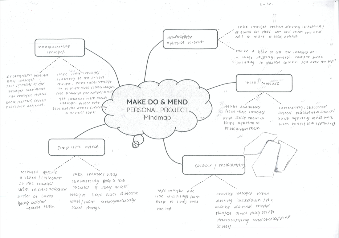
So instead of using photographs from throughout this project I wanted to take completely new photos from something old and used I found around the school. I wanted something that would create a contrasts between light and dark so that when I edited them in photoshop it would look better. I found an old stretched out slinky in the technicians office, I thought this would be perfect as not only would it create contrasts but also really cool shadows adding more line and confusion to the images- almost like the whole idea of make, do & mend.
In order to make the lines of the wire stand out I used a white background and a light close up to the white backdrop to make the light harsher and the shadows stand out more. I think they came out so nicely:
In order to make the lines of the wire stand out I used a white background and a light close up to the white backdrop to make the light harsher and the shadows stand out more. I think they came out so nicely:


After taking these photos I edited some of my favourites on my phone to heighten the contrasts and changed the brightness settings. I think I managed to achieve the look I wanted really well the the way these have come out it think the will look really good once photoshopped. I think the shadows can look like the wire itself making the image look even more busy and crowded with many different lines- almost abstract. The only thing I would say about these photos is that they are quite boring in the fact that the colours are very mutual but this is what I'm going to fix In photoshop. I think the randomness of these organic lines really reflects the make, do & mend theme as when you are given something with lots of limitations usually one will become more creative in some ways and produce something that you would never have thought to come out of it in the first place- something completely random.
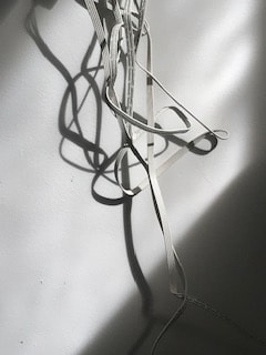
PHOTOSHOP EDITING
My whole idea for my final outcome to these photos is to edited the images like I did the example image above so that the lines and colours become distorted and more abstract- making the images more interesting. I achieved this by using the photoshop app on my phone. Heres how they turned out:


I am so pleased with how these turned out, the fact that the lines of the wire have been duplicated makes these look so ,much better. Furthermore the contrast between different colours and the almost animated feel, as though the have been drawn, makes these abstract and fun. I think perhaps they look a though someone has captured a photo of someone swirling something in the air, like capturing a certain moment. I don't think people would really be able to tell straight away what these images are of which I love as the make, do & mend project is all about using something old or used with restrictions and turning it into something completely new. I believe that is what I have done here.

|
This is my favorite out of them all as I love the color scheme. For this one I adjusted the brightness and contrasts before I put the filter on it to make it have this cool affect. I believe this made the lines and colours come out really nicely. I think the organic curvy lines of the wire look so good overlapping and filling the image. I also believe this is the most abstract one may not guess what this image was originally of which I love. I have turned an old stretched out slinky into a really cool, colorful abstract image. I think this reflects the project really well. |
MORE PHOTOSHOP EDITING
Before going on to make a response to the artist ,I wanted to play around with these images on photoshop to see if it would look interesting as the lines are really confusing and cool. i practiced with my example image first ,heres what I did:
I really like how this technique turned out, I believe the curvy Lines of the circle tie in really nicely with the lines of the wire. Furthermore, the fact the circles disturbed the composition of the image and the lines within it made the contrasts between colours stronger- it looks far more visually interesting. I think when I apply this technique to my actual images of the wire I will include more circles and perhaps make it look less discrete so that its more subtle and so hat the lines don't match up but not so obviously. For this will perhaps confuse the viewer and make them want to observe for longer. overall, I think this photoshopping added to the make, do & mend theme as I have further developed an image and created something completely new from it, I think the process of continuing to add this and play with the image ensures that it comes from something boring or old and turns it into something really interesting and exiting.
Now onto editing the images of the wire...
Now onto editing the images of the wire...


I am really pleased with these images and this editing technique. I followed my advice and edited more circles into the photo and made the lines less obvious. I think because the lines are so distinct and in different colours this technique worked really well, the sudden disturbance of the organic lines breaks the flow mod the image making it more abstract and visually interesting.
ARTIST INTERPRETATION
Finally I decided to do a development of the images inspired by Simoes work. I decided to print out my images cut them out and layer them onto of each other to create the tunnelling affect smiles work has. However, I wanted to make the lines and edges less perfect to mach my images which are rather messy and random. I cut out the layers in jagged lines to contrast with the organic curvy lines of the wires.


I don't really like how these came out although the jagged lines do contrast nicely with the lines in the images. I did achieve the tunnelling affect but I needed more layers. Overall the photocopying made the colours in the images dull and I think this ruined them.
