MY DEFINITION
To me abstraction is a form of art in which mood is depicted through the use of line, shape, shadow and colour. Abstraction is the opposite of realism where artists will make there work look as does in real life. Abstraction can be anything from perplexed to it having a rather mellow mood.
This how the dictionary defines abstraction.
Here is my Pinterest board on abstraction...
We where asked to create a Pinterest board for abstraction to really get a sight into how may different forms of abstraction there are.

As you can see there are many forms of abstraction. I think that my favourite form is probably one line drawing. My reasoning for this is that for me they show extreme feelings or moods that many can relate to. This is strange that something that is only created from one line can show so many different emotions.
FORMAL ELEMENTS...
In order to analyse an image, in photography, we must use the 8 key elements:
Focus: Which areas appear clearest or sharpest in the photograph? Which do not?
Light: Which areas of the photograph are brightest? Are there any shadows? Does the photograph allow you to guess the time of day? Is the light natural or artificial? Harsh or soft? Reflected or direct?
Line: Are there objects in the photograph that act as lines? Are they straight, curvy, thin, thick? Do the lines create direction in the photograph? Do they outline? Do the lines show movement or energy?
Repetition: Are there any objects, shapes or lines which repeat and create a pattern?
Shape: Do you see geometric (straight edged) or organic (curvy) shapes? Which are they?
Space: Is there depth to the photograph or does it seem shallow? What creates this appearance? Are there important negative (empty) spaces in addition to positive (solid) spaces? Is there depth created by spacial illusions i.e. perspective?
Texture: If you could touch the surface of the photograph how would it feel? How do the objects in the picture look like they would feel?
Value/Tone: Is there a range of tones from dark to light? Where is the darkest value? Where is the lightest?
We where given this image to analyse using the key elements

FOCUS
This Image is perfectly in focus. I believe this makes the image look clean and flawless and all areas seem sharp and purposely composed. It also makes it a little confusing as there isn't just one thing to focus on.
LIGHT
The light in this image is clearly artifitial as it is harsh and gives of strong shadows beneath the orange object. Another reason why I believe this is artificial lighting is because it seems digitally created and edited as it doesn't look realistic. The light creates shadows which make it look 3D.
REPETITION
There is a repetition of geometric lines and colours in contrast. However all these aspect have thigs that disturb them. For example the geometric lines are disturbed by the fold in the paper which creates an organic line.
SHAPE
This image is composed of two rectangles one blue one orange. these bright bold colours create a contras. However, because the blue is the only different colour on the image it stands out the most. This makes is look pure and undisturbed.
HERE IS ANOTHER IMAGE

|
This Image, like the other, Is mainly all in focus although the back two buildings have a slight blur about them. This interesting as it makes the image look like a painting and unrealistic. Almost as though the front two building are real but the others aren't. The red house running along the bottom of the photo is the brightest part of the image. This creates contrast to the rather dull building and sky in the back drop. The two buildings running perpendicular to each other contrast the the two in the back for the front two have geometric edges but the two in the back have more organic edges. However, the red building running along the bottom also dissatifies the direction of the image and buildings. This image is composed in a way so it looks abstract. if the composition wasn't the same is would just be a regular image of buildings.
|
HOMEWORK...For these images I decided to focus mostly on shadow and reflection. I decided not to include too many colours so that they will suit each other. The direction in many of these images flow down and then disperses diagonally out. Some don't have a direction and therefore have a sense of stillness or have many directions creating a sense of conflict and confusion. Others have just one direction. I think the top middle image is my favourite as the small light at the top disperses into rays and this creates a sense of relaxation and harmony. I further feel this for there are no harsh contrast apart from the bright light. However, this light is soft. Next time I will focus more on colour so it doesn't created Such a monochromatic feel.
ABSTRACT PHOTOGRAPHS TAKEN IN SCHOOLFor this task we where asked to take abstract photographs around the school focusing mainly on two of the key elements. I decide to focus on light and focus.
|


I had never taken images in this way before so it was a change not to necessarily have everything in focus or to not stick to any restrictions or rules. I think next time I will experiment with more tonal values and try to spot more abstract photo opportunities. I believe that most of the photographs are boring and not very interesting to look at. However, I did add more colour than last time making them slightly more interesting to look at.

I think that this one is one of my favourites out of all the photos I took today. I believe this because nearly all of the tonal values are depicted throughout this image. It is out of focus, the light make the colours brighter and harsher, The lines of colours create an effect where you don't know what the image is actually of, the repetition of the colours is broken by the jarring white light, the shapes are soft and geometric contrasting to the white light, when I look at this the texture seems soft.
Next time, in think I wld zoom out just a little to allow more colours to be added and more defined lines would be displayed.
Next time, in think I wld zoom out just a little to allow more colours to be added and more defined lines would be displayed.
TAKE TWO
This time I decided to take my feedback in and experiment more with the overriding theme of abstraction.


Another way I experimented more was playing with vibrant colours and contrasting them to more gentle colours.I am far more happy with how these came out for I experiment more and decided to zoom in and play with line and shape. Also focusing on reflection resulted in really cool end results. I find it really refreshing to explore new ways in taking photographs and exploring new Ideas. I especially like the ones which are out of focus and ones in which you cant tell what the actual thing you where taking the image of because one either zoomed in or blurred the image.

This is my favourite image. I like this image because you can't make out what it is so it is left to opinion. This leaves the viewers confused and makes it look even more abstract. The strong pure colour of orange is broken by lighter less pure object in the far right corner that looks like many irregular shapes stacked onto of each other. The could create a sense of unease or tension in case they topple. This creates contrast with the pure orange as the adjective pure symbolises peace, satisfaction and relaxation. However, the word unease symbolises dissatisfaction, restlessness and constrained.
HOMEWORK


These are by far my favourite set of images. I have reflected on all my other feedback from my other shoots and have improved. As you can see I have used more colour and far more techniques i took into consideration the formal elements further. I think that i focused on focus and composition the most.

|
This is my favorite image out of all as the vibrant yellow really bursts out and you cannot tell what the image is of. This makes the image abstract, further adding to this is the organic lines made my the reflection of the sunlight. This is a natural photo not taken by a man made object and there for can never be re taken. This adds a mysterious feel to this image creating a meaning. This again makes it more abstract. |
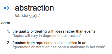
PATRICK LEARS


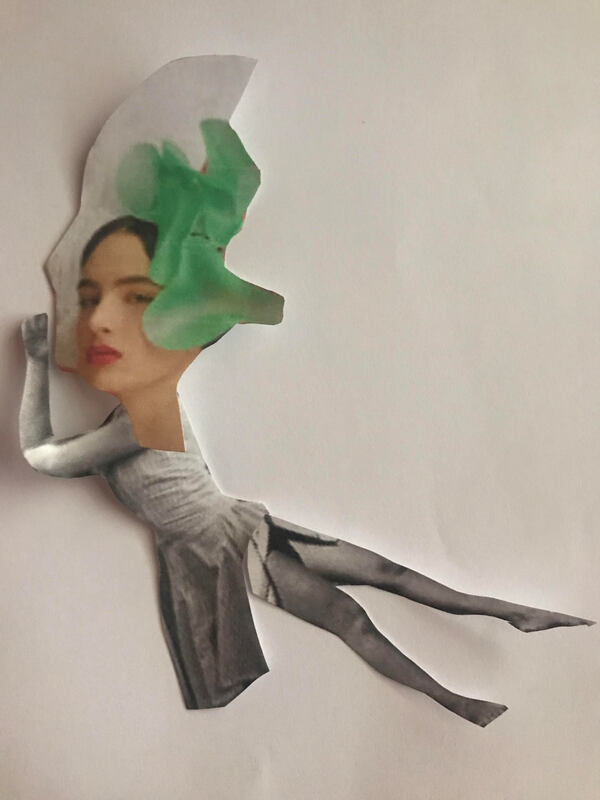
To me this image has woven complexity and abstract features thorough-out it for the image does not look like a realistic object or thing. Nevertheless, in abstract images the main concept is the meaning. Depicting the meaning, I believe that the blue and orange colours which bulge out and contrast to the rest of the ramshackle, monochrome background show perhaps a sign of hope. The other colours aren't as pure because they are ripped and have jagged edges. This could symbolise that those segments of hope are deteriorating. To me this image has similar features of other abstract creations form other artists. This further induces the sense of abstraction.
In my opinion, this image displays all of the formal elements clearly. For example the space and how things are layed out are the main elements since it is a collage. The feel of misplacement and descending creates a constant perception of conflict. This is why the rare surges of colour perhaps display a feel of hope.
In my opinion, this image displays all of the formal elements clearly. For example the space and how things are layed out are the main elements since it is a collage. The feel of misplacement and descending creates a constant perception of conflict. This is why the rare surges of colour perhaps display a feel of hope.
"I worked for a while as a photographer. Some years into this I noticed a surplus of black and white prints that was accumulating - especially prints that had been dodgily exposed or developed. I was reluctant to throw them out. In time I started to cut them up - finding the essential in the sum of disparate parts by conjuring a new work."
-Patrick lears
This describes a bit about his practice.
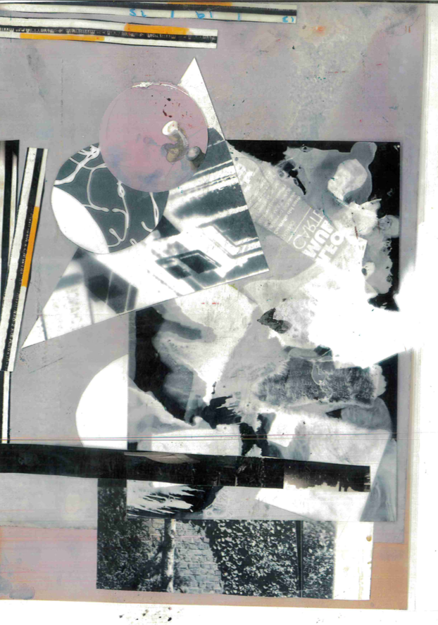
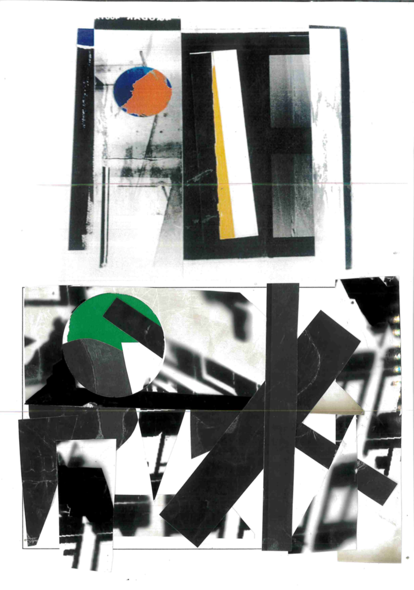
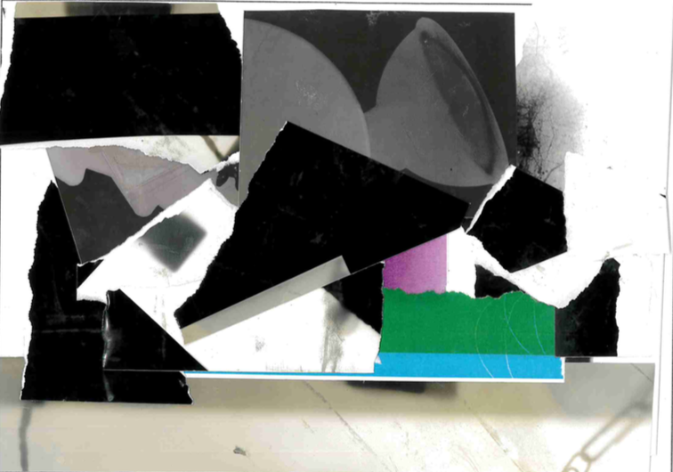
MY TURN
|
|
|
This task was inspired by Patrick Lears' work and practice. We picked some old unused photograms that where turned over and we weren't allowed to see. This would make the final result more abstract and stop us from overthinking.We where also allowed to colours. These where the collages I came up with.
www: I believe my favourite out off all is the top left as it incorporates a colour palette of a monochrome of pink with colours popping out. This is a break from a usual image's reality as people create monochrome's of black and white but for this image it is pink. This could also show a less cold dreary mood but a warm welcoming one. However, this broken by the sharp line and dull colours off the triangle and other parts of the photogram. This could show something invading another. EBI: |
PHOTO BOOK IMAGES
For this task we where asked to create a photo book using all of the different formal elements. I used some old photographs as well as these new ones:


These are some images I used for my photobook, I'm really proud with these for I trailed many different techniques and varied my four in each. Some of landscapes, some of objects and some of just shadow and light. I mostly approached the element of zoom to capture an al most artificial look rather than it looking legitimate. This gives a more abrupt abstract feel. I would also sometimes use flash whilst shaking the camera to blur and duplicate lines and giving the image a distorted look. whilst taking these photos I learned that line and light are (in my opinion) two of the upmost key elements.
|
This is my favorite image.
|
PUZZLE 'EM
This project is one of focusing on puzzling the audience and trying to distort everyday objects by taking them from different angles and trying to distort the object as much as possible. This will leave the audience confused and turns everyday things into something people can no longer recognise. This kind of abstract work in one where Photographs consist of formal and visual elements and have their own ‘grammar’. These formal and visual elements (such as line, shape, repetition, rhythm, balance etc.) are shared with other works of art. But photographs also have a specific grammar. For example: flatness, frame, time, focus and many more. ‘Mistakes’ in photography are often associated with breaking the ‘rules’ and expectations of this grammar for example something being out of focus, subject cropped, blur etc. Some photographers enjoy making beautiful images but others are more critical of what beauty means in today's world. This is a little like breaking out of tradition and moving into being more original with the work created.
The task is to take a series of puzzling photographs (minimum 10) based and inspired of/by other photographers. Therefore we have to research about at least two photographers who take unconventional photographs of objects that might puzzle the viewer and begin generating ideas based of this. Once considering this new technique we must take to photoshoots experimenting with different materials process and techniques refine our ideas. After this have to display and present our most refined favourite images and reflect and evaluate appoint the experience and final outcomes. n
The task is to take a series of puzzling photographs (minimum 10) based and inspired of/by other photographers. Therefore we have to research about at least two photographers who take unconventional photographs of objects that might puzzle the viewer and begin generating ideas based of this. Once considering this new technique we must take to photoshoots experimenting with different materials process and techniques refine our ideas. After this have to display and present our most refined favourite images and reflect and evaluate appoint the experience and final outcomes. n


Berenice Abbott
For this reaserch I decided to look at two sources from the internet.
One was from the international centre of photography:
Bernice Abott spent the early part of her artistic career studying sculpture in New York, Berlin, and Paris, where she worked as Man Ray's studio assistant. This experience led her to photography and soon became an independent photographer.
In 1929, Abbott returned to the United States, where she set out on her best-known body of work--a documentation of New York City for which she developed her famous bird's-eye and worm's-eye points-of-view.
One of Abbott's later final projects was an illustration of scientific phenomenon. These images are amazing and exquisite examples of her quick desision making for technical experimentation and her natural instinct for combining factual photographic detail with really good artistic accomplishment. With their clear visual demonstration of abstract scientific principles, the photographs were chosen to illustrate physics textbooks of the 1950s and 1960s. These images where either looking up from a worm height or looking down from a birds point of view. They can come across as quite intimidating for the objects are looming over the audience. Here are some of these abstract images:


BRASSAï
Brassaï was a Hungarian and French photographer born in 1899 until 1984 when he died. He created many iconic photographs during his lifetime. Brassaï created his artist name based on his hometown Brasso where he lived until 1924 when he moved to the city. Brassaï tended to capture the more difficult side of life in his images however his images also consist of his friends and acquaintances such as Pablo Picasso, Salvador Dalí, and Henri Matisse. Brassaï became interested in graffiti he saw it as a form of Outsider Art that could mean he could express himself through a new type of art. Brassaï adopted his fictional name from his hometown. He studied sculpture and painting at the Hungarian Academy of Fine Arts, and in 1920 moved to Berlin. He was soon internationally famous for his images where widely adored. He was originally a journalist but only turned to photography when At night he would venture out to capture the city's deserted streets, its shadowed monuments and gave quite a scary view to the streets at night. He finally made a expedition about this work and named it "Paris By Night":


MY FINAL IMAGES:
These images are the ones I will use to make my final piece for the puzzled em' unit. Some I took in school and some at home.


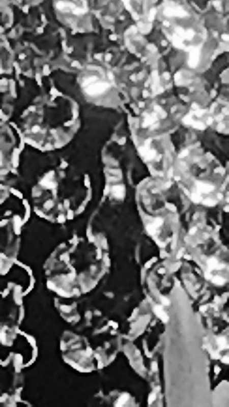
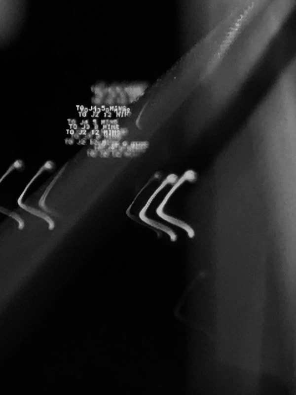
For these Images I selected my favourite images from my puzzled 'em shoot and edited them to black and white. The back and white effect would make it even harder to recognise the object the image is of, it also furthers the intensity and mood. I am personally really proud of these images and think they will make a really good game. However, some of them are pixilated and although this adds texture and makes it harder to read what the object is, it doesn't look very professional. As an improvement. text Time imiill ensure my camera is focused and that I'm not too zoomed in.

|
This image is my favourite out of them all. This image is of light reflecting off an earring. I Iike this image because the contrast between light and dark create a strong intensity and hightens the drastic sense of the array of light. Even though most of the image is dark there is still a sense that its day because of the bursts of light that would be able to be accomplished at night. |
HOMEWORK:
For this task we had to take photos of everyday objects against a white background from unusual angles.


These are my images that took focuses on the puzzle em'
